
Basic briefing:
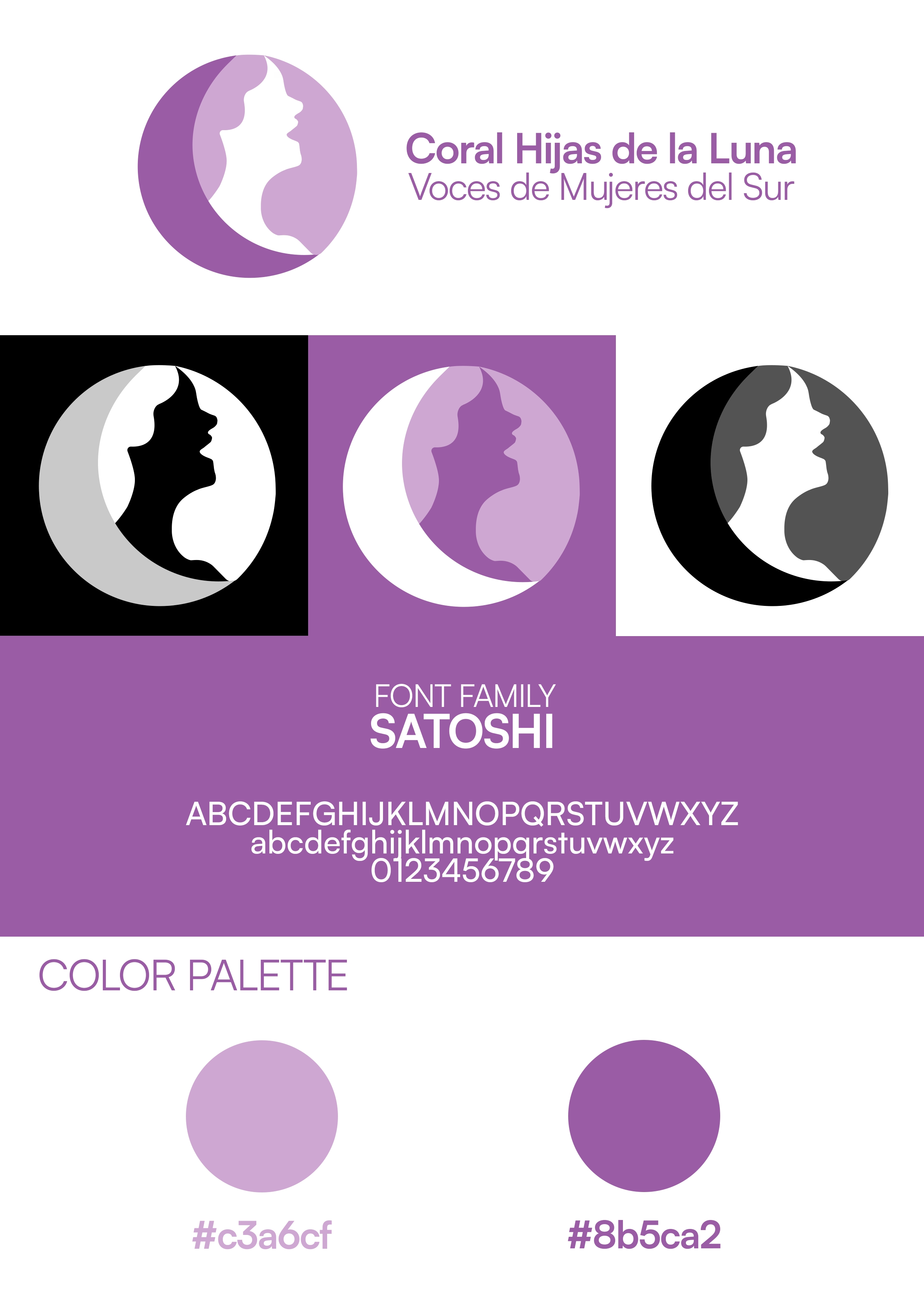
Women's choir from Córdoba with a very clear identity: feminism, equality, and fighting gender violence. They requested a logo where members could feel represented — not a generic silhouette, but a figure that directly spoke of them and their message.
Identity elements:
Isotype: Female profile inscribed in a crescent moon, responding directly to the request for female representation. The enclosing circle symbolizes group cohesion and the union that defines a choir.
Colors: Violets #c3a6cf and #8b5ca2, historically associated with the feminist movement, conveying creativity, sensitivity, and sisterhood.
Typography: Satoshi, clear and balanced.
Result:
The branding communicates at a single glance who they are and what they stand for. The female profile in the moon satisfies the need for representation, the violet color anchors the feminist identity without explanation, and the circular shape reinforces the idea of a collective and shared voice.
Basic briefing:
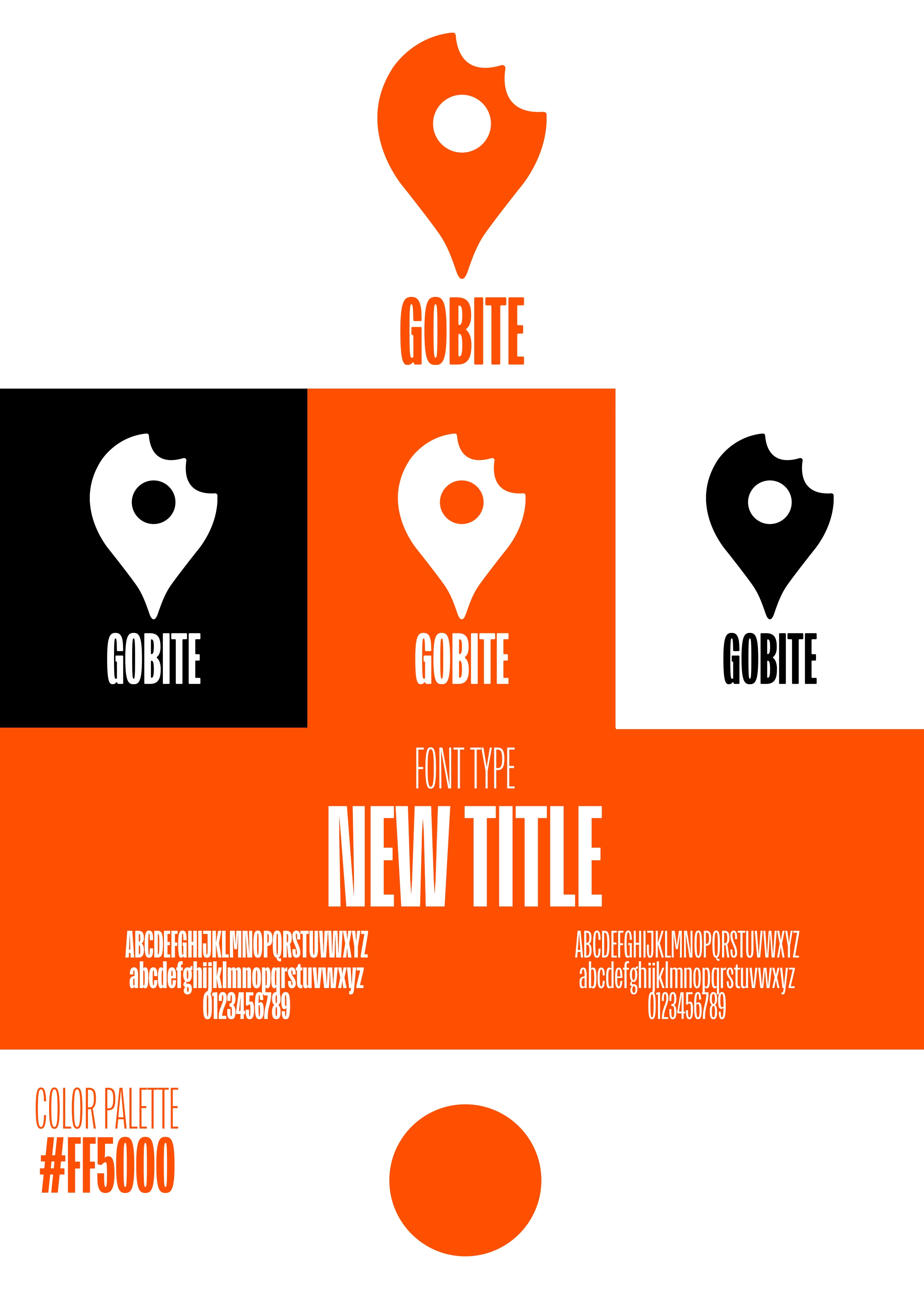
Gobite is an app that consolidates all the sources we use to decide where to eat in a single place: reviews, TikTok videos, recommendations from different platforms. The client provided the corporate color and requested a very minimalist identity, designed to work well in digital environments where the brand competes with a lot of visual noise.
Identity elements:
Isotype: Combination of location marker and a bite, communicating in a single symbol the two axes of the app: where and what to eat.
Color: #FF5000, provided by the client. A vibrant orange that conveys appetite, energy, and screen visibility.
Typography: New Title, clean and contemporary.
Result:
The requested minimalism becomes a functional advantage: the isotype is legible and recognizable at any size, from an app icon to a banner. The identity fits naturally into the digital environment where Gobite lives — social media, mobile, web — without losing strength or clarity.
Basic briefing:
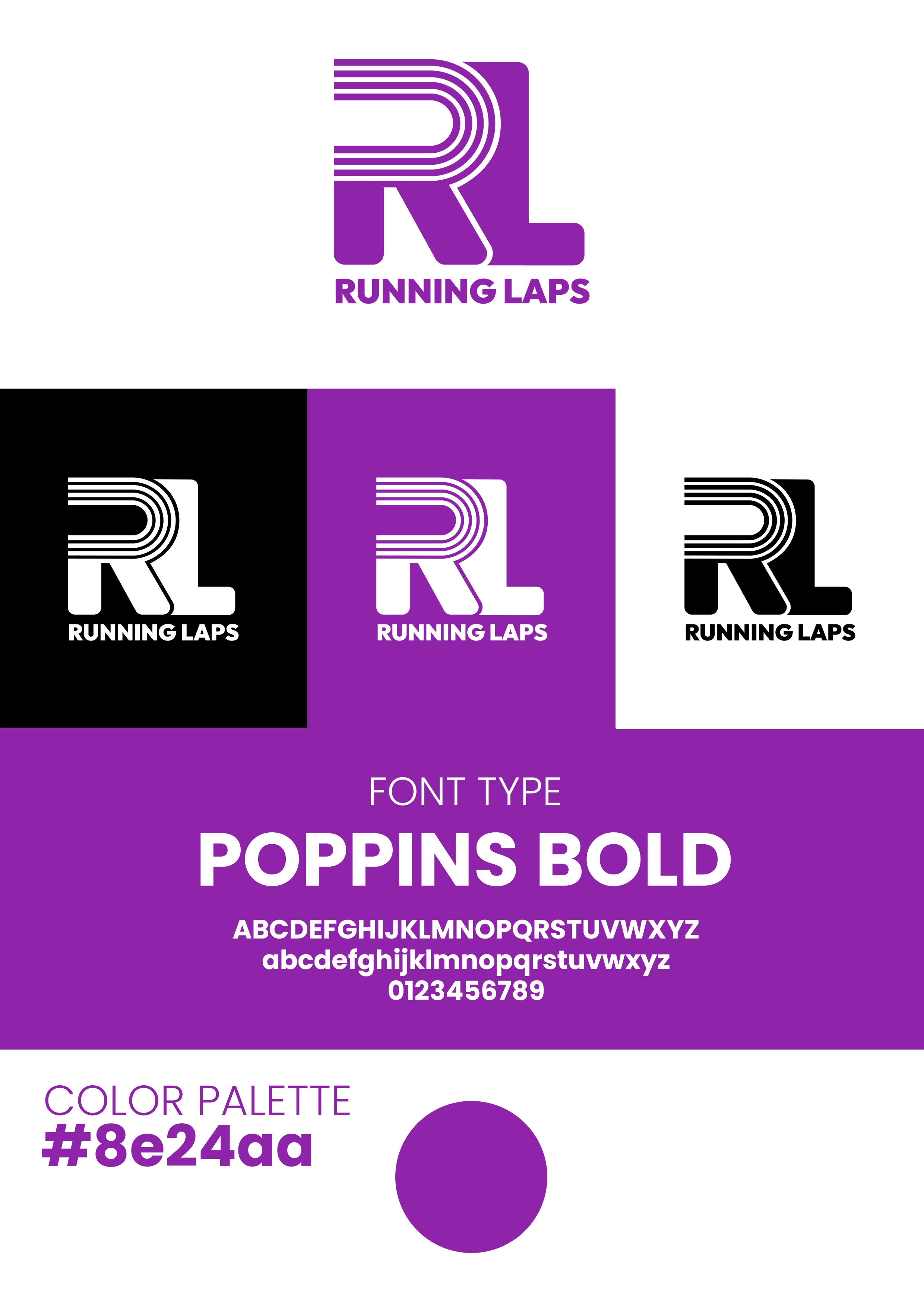
A running app oriented towards interval training, the type of work usually done on an athletics track. It is not just an app for casual jogging — it is for runners who train structurally, by time and repetitions. The client provided the color and gave total freedom to build the rest of the identity.
Identity elements:
Isotype: The initials R and L integrated through parallel lines that directly evoke the lanes of an athletics track, connecting the form with the context of use.
Color: #8e24aa, provided by the client. An intense purple that communicates energy, determination, and differentiation in a market dominated by reds and oranges.
Typography: Poppins Bold, for clarity and visual presence.
Result:
The identity speaks directly to the interval runner: the isotype refers to the track, the color breaks with industry expectations, and the typography provides solidity. The combination works just as well on a mobile screen during a workout as on any brand collateral.
Basic briefing:
Behind Panar, there is more than just a store for home bread-making tools: a meeting space where the community comes first. Blog, free online courses, paid in-person workshops, content shared between baking enthusiasts. The identity had to convey this spirit of belonging before selling anything.
Identity elements:
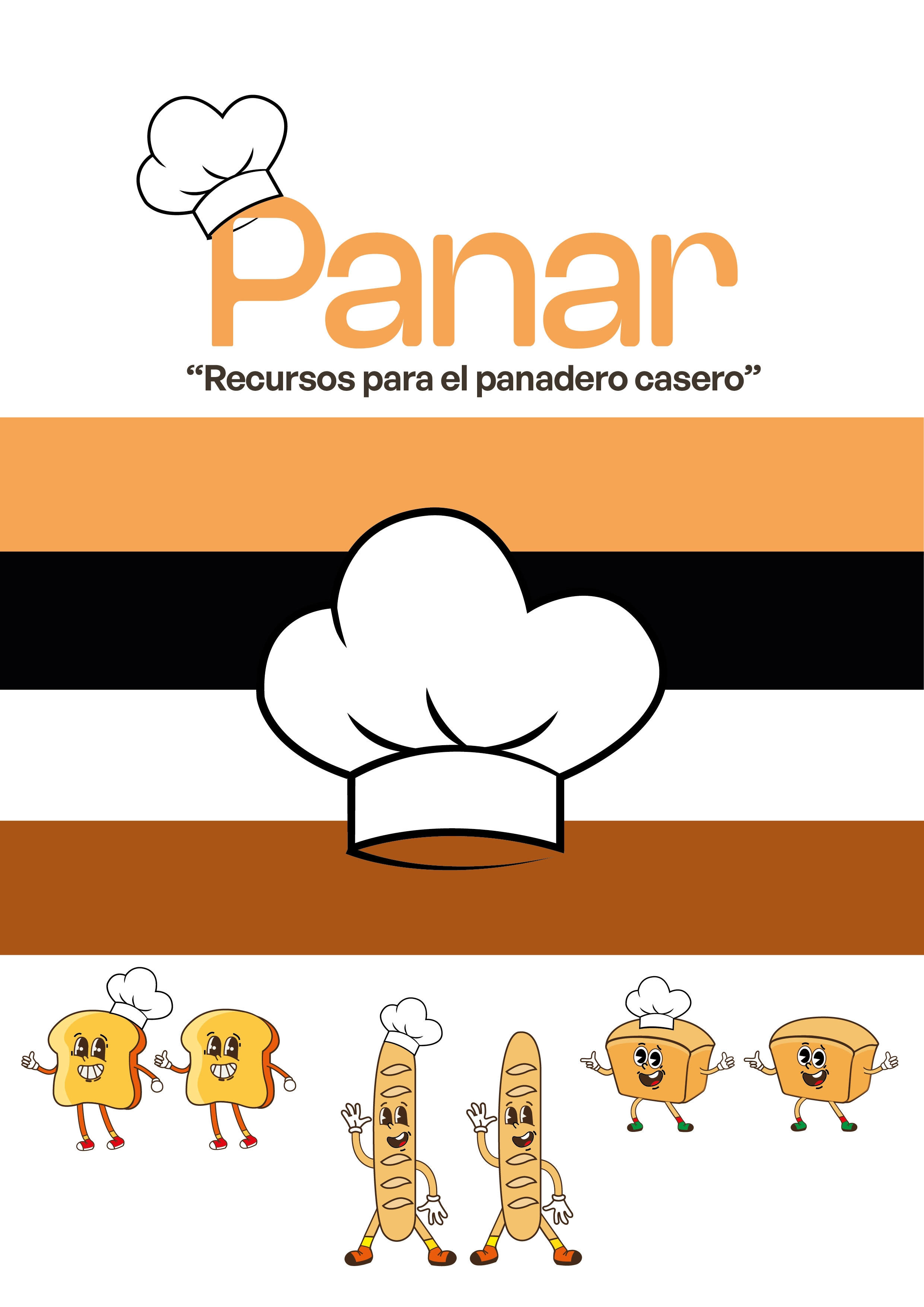
Logo: Rounded lettering accompanied by a baker's hat, placing the brand in its territory without turning it into a generic store. The soft shapes reinforce proximity and the community tone.
Colors: Warm tones that refer to freshly baked bread and create a welcoming atmosphere, consistent with the brand's gathering spirit.
Typography: General Sans Semibold, modern and legible.
Result:
An identity that works equally well in an online store and an in-person workshop, because in both contexts the message is the same: you come here to learn and connect, not just to buy. The brand conveys warmth without losing modern appeal, and community without sacrificing brand credibility.
Basic briefing:
Identity for a real photo exhibition inaugurated at the Hospital Universitario Virgen del Rocío in Seville, documenting the impact of restorative tattooing on oncology and surgery patients: areola reconstruction after mastectomies, scar covering, burns. A project about recovering self-esteem through art on the skin, promoted by the hospital, patient associations, and specialized tattoo artists. Creative freedom with three conditions: no explicit tattoos, in harmony with the logo of another collaborating entity —also purple— and with the emotional weight of the project present in each piece.
Identity elements:
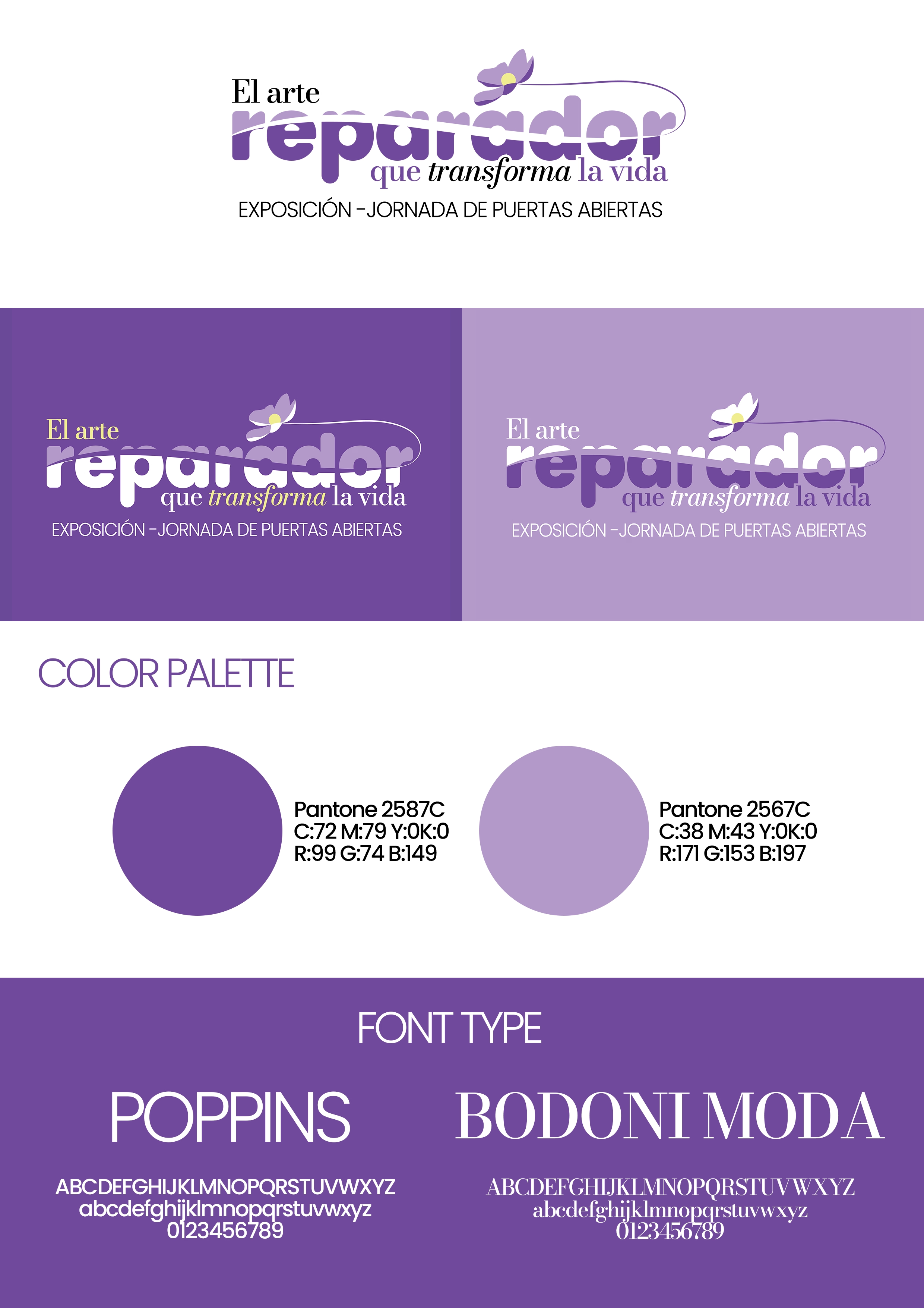
Visual system: The name of the event is divided by a scar that transforms into a flower — a direct visual metaphor of the transformation proposed by the project. The symbol also works independently.
Colors: Pantone Violets 265C and 2567C, in line with the collaborating entity's logo and carrying symbolic weight associated with sensitivity, creativity, and dignity.
Typography: Combination of Poppins (clarity and accessibility) and Bodoni Moda (editorial character and cultural weight), balancing institutional rigor with the emotion of the narrative.
Result:
An identity that communicates the gravity and beauty of the project without resorting to explicit images. The blossoming scar says it all: there is transformation, there is life after. The visual system works in the hospital setting, in press materials, and on event collaterals, maintaining coherence with collaborators and dignity towards the patients represented.